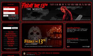
Friday The 13th: The Website v3.1
 If you have the time, check out the new main page of fridaythe13thfilms.com. It now integrates posts and comments from here. There are a few tech issues I am working on (namely broken links with pre-existing site content) but they’ll be sorted out by the end of the weekend (if I don’t get too caught up in GTA IV). 10 months into my run on the site, it’s starting to be a little more of what I want it to be, what with the image gallery, this blog and now the new main page, but I’ve still got plenty more to do, and as you can see I’ve been rolling out the changes at a steady but careful pace. The next big change will probably be a large departure from the norm, but that’s why I’ve saved it till last… to hopefully get you on side and trust my vision for the site before I make my final gambit.
I’d also like to holler out a welcome to Tony & Christian who have been helping keep this blog up to date. I am looking for maybe one more machete monkey to come on and catch any remake news we miss (had a lot of big promises last search but many people just vanish off the face of the earth when it comes time to walk the walk).
I’m probably my own worst critic, but let’s see what you guys think - you know the deal, constructive comments or criticism will be appreciated (unless it’s “where’s the forum, jackass!” - discussion is now right here, learn to live with it). I’m open to any sort of tweaking or ideas you have for improving what has always been (and hopefully still is… or will be again, at least) the ultimate Friday The 13th website.
May 24th, 2025 at 3:35 pm
Just wanted to drop in and let you know that I think the site looks absolutely awesome John. I am happy to be on board and look forward to contributing well into the future. I was always a big fan of this site. And being part of it now have been great. I’ve always been a sucker for Jason merchandise. I have some stuff I’m cooking up in the near future that should be good. Thanks again for the opportunity.
May 24th, 2025 at 5:34 pm
Site looks good. I can’t find a way to get back to the main site from the blog, though :(.
Tony has been awesome, too. I love his interviews, and the pictures in his reviews have been great…great stuff. Keep it up.
May 24th, 2025 at 11:19 pm
t-d0gg, thanks for catching that. There’s now a link on the righthand sidebar.
May 24th, 2025 at 11:38 pm
I’d still say it would be nice to have a fan game section!
Since there quite a few out there, the fan section is great already though.
I like the new look though, keep it up it’s great!
May 25th, 2025 at 12:16 am
Aw man! This site looks awesome! Love the layout!
May 25th, 2025 at 1:34 am
RE: I’d still say it would be nice to have a fan game section!
You can always start a game in this or any thread. Either a quiz, multiple choice, Six Degrees of Kevin Bacon (though that may be a little too easy as he was in the first movie) or whatever. Or ask a trivia question and see who gets it first. Lots of fun
May 25th, 2025 at 5:11 am
Dusk, might want to make the repliers who have black boxes (i.e. Havoc and Christian’s) have a differant color font. That way, they don’t have to be highlighted to see them. Come by the board more often too ;).
~JS
May 25th, 2025 at 5:01 pm
You should make the News and Updates section like the previous version, but allow it to make comments, that’d be a better look. Make a forum separated from the main site for other discussions, and categorize it. That’s all I can say.
May 27th, 2025 at 4:55 am
Great job, I really like it. I’d love to see a new forum, and I think I know why you guys don’t want one. I myself don’t care if it’s a crappy InvisionFree forum. I like how the new site looks though, you’re doing a good job!
May 27th, 2025 at 5:54 am
Jason’s Storm: Font/background should look better now. Let me know.
Random Jason Fan/JVM: By agreement with the original owners I cannot have a forum even if I wanted one (and I don’t right now). It has pushed me to make the site itself more interactive, which I think will payoff in the long run rather than just slapping a forum up.