Sequel Poster Contest: Admin Favorites
I want to say that I appreciate everybody’s work and am glad so many visitors supported this contest. I figured that now that the voting is closed, I would mention some of my favorites that were submitted. The winner will be announced Monday morning, so keep an eye for that. The posters I mention below are just my personal favorites and will not reflect who wins the contest as the visitors have spoken. Dusk may post his thoughts on these posters as well.
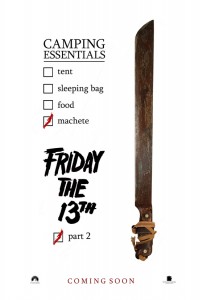
SJ_5: I found this to be a perfect example of a teaser poster. You know what the movie is, but nothing else is given away and the message is given to the viewer in a very clever way. I would say the only thing that would make this better would be to drop the “Friday the 13th” title and make people work a little harder to guess at what the movie is, although with this poster it wouldn’t be too hard. I could see this as a real teaser poster in a theater lobby.
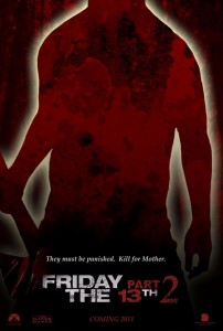
 MP: A great homage to the original poster design of the original 3 movies and it sports a great tag line that actually made me think about the fact that Jason probably hears that in his head every minute of the day. I would say that losing the “Friday the 13th” title in this poster would aid in making it darn near perfect as a teaser poster. I think that only more educated Friday the 13th fans will pick up on what movie this was if the title was removed.
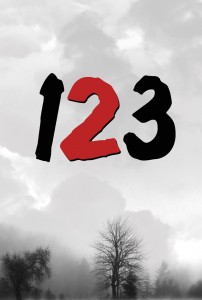
 CP: This is the ultimate teaser poster with a creative play on numbers that only real true fans could pick up on as they casually passed by this in a theater lobby. That might be the only problem with this poster as it might not get out to general audiences what the movie truly is. It would create a level of buzz, no doubt about it, however.
Working in the theater business, I have seen a lot of posters. I mean a lot. One of the best marketing campaigns I have ever seen for a movie is Godzilla (1998) from Sony pictures. They were putting teaser trailers and posters out in theaters over a year before the release of that movie. The buzz it created was enormous. Almost too much buzz as the movie just never lived up to the hype. With these teaser posters I have chosen, I think this would be a good foundation to start a marketing campaign for a new Friday the 13th movie. Creating a marketing campaign? What a good idea for new group of contests ……..
In the end, the movie itself would have to be good, or all of the marketing in the world would not save it from failure. Well, hope everyone is happy with the results of the voting that we post tomorrow.

Thanks for the compliments on my poster (SJ_5), jasonsfury. Much appreciated.
i voted for SJ_5 too. great poster art!
SJ_5 is very nice!