Region 2 Friday the 13th DVD Cover Review
All eight Paramount movies have been out on Region 2 DVD for some time now, but I never looked at all of the cover art as a whole collection until recently. And since I am on a DVD kick today I thought I would review the covers and their signifigance to each movie.
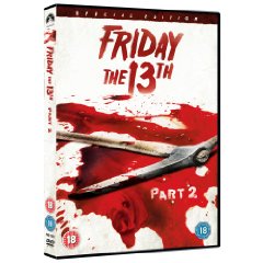
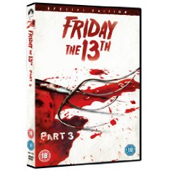
Although the Pitch Fork was used in a tense scene in a cabin in Part 2, I will always remember the pitch fork in all of its 3-D glory. As the biker Loco climbs up to the top of the barn to find Fox, Jason brings the 3-D pitch fork into the audience and stabs Loco through the stomach.
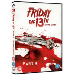
This cover shows that the people behind the cover art did their homework. This is my favorite cover as Jimmy’s (Cripsin Glover) death is one fo the best of the franchise. As Jimmy gloats over his conquest to Ted, he wonders into the kitchen to get a bottle of champagne, “to celebrate”. As he screams to Ted asking where the corkscrew is, Jason rams it into his hand on the kitchen counter and then slams a meat cleaver into his face.
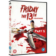
Another example of people knowing this franchise. The hedge clippers were only ever used for killing in this vastly underrated installment. This instrument of terror was used twice. Once onscreen and once offscreen. Onscreen Tina lays naked in the forest as Pseudo Jason Roy gouges out her eyes with a quick stab and cutting motion.
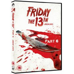
Jason’s main weapon of destruction in Jason Lives. The machete sits in his holster around the belt he lifted off of company exec turned paint baller Roy. Shortly after Roy’s demise Jason uses his favorite weapon in a triple decapitation of three other paintballers
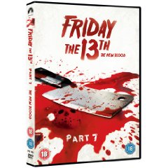
The only cover that baffles me. Not one single person in The New Blood was killed by a meat cleaver. This device was used in numerous other Friday movies, but this was not even shown or mentioned in any frame of this movie. The weapon I would have chosen for the cover would have been the gas powered saw that Jason used to kill Dr. Crews. It was unique to this movie and would have looked awesome on the cover art.
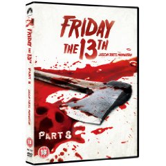
It’s suprising that out of all the movies the distributor would have chosen to place an axe on the cover art, they would have chosen Jason Takes Manhattan. Most would not even think of an axe used in this movie as pretty much no classic instrument is used against Jason’s victims in this movie. There was a sauna rock, rock guitar, heroine needle, shard of glass, harpoon arrow, a barrel of toxic waste, and Jason knocking Julius’ goddamn block off. Well I stole that line from Return of the Living Dead, but you get the point.
There were very unorthodox weapons used in this movie. However, there was the axe that was thrust into the Crazy Ralph like deck hand offscreen. He appears in one scene with it sticking out of his back. Later Sean sees Jason standing at the edge of the boat holding an axe in hand. The axe does work for me in this cover, but I would have personally liked to have seen the guitar!


Like those covers alot.
they should’ve used a harpoon for part 3. wasn’t that the first kill he did with the hockey mask? either way, awesome covers.
aside from fucking up 7 & 8, they’re decent. i have 2 & 3 on blu-ray ’cause i couldn’t wait for the US releases months later…i think the design of part 3 is a little weak the way they worked his mask in there. …but it’s better than some of the half-assed work on a few of the US ones, so i’ll take it.
hmm. im kind of on the fence about these, they give them a nice simple look, but they are also very impersonal. plus the reuse of the mask if different covers. i do like them better than the region 1 deluxe covers though. true some of the weapon choices are strange but i would have preferred these over the usa deluxe covers
hmm. im kind of on the fence about these, they give them a nice simple look, but they are also very impersonal. plus the reuse of the mask on different covers. i do like them better than the region 1 deluxe covers though. true some of the weapon choices are strange but i would have preferred these over the usa deluxe covers
why isn’t Part 1 included in this art series? If it were, it would be cool to have a bloody bowie knife. Would they have Mrs Voorhees in the blood? I guess that would ruin the surprise ending. These are ok. in total agreement on the parts 3 and 7 cover comments; would’ve liked to see the hedge mower and the harpoon gun. Gardening claw might’ve been cool for pt 4 too, since he never actually killed anyone with the corkscrew. That scene is all kinds of awesome though. Crispin Glover was hilarious.
I kinda like the basic minimal look to the covers.
I like how each cover has a different weapon lying in a pool of blood.
I also like how the hockey mask is in the blood in each cover and the sack is in the blood for the Part 2 cover.
there ok i\’d how jasons mask looks in each movie in the cover
Looks more like “Saw” movies.
They’re shit releases though. I ordered the r1 ones instead.
Would it be worth leaving these issues & waiting for the new delluxe editions to eventualy come out in Scotland? Artworks quite cool if a little basic, but theyl never be worse than the paramount releases that have been kicking around forever & a day
The axe should’ve been used for Part 7. Remember the sexy blonde bitch Melissa getting an axe to the face after telling everyone to go fuck their self, that was a great scene.
The deckhand in part 8 did have an axe impaled into his back when he fell over.
These covers are horrible. For the most part, they are mere “sidenotes” to a single death committed in each film. If you put them all together, they would look like a product catalog for a metal works factory.
These films are benchmarks and need to be given better treatment than this. At the very least, Dick Wieand needs to be on the cover of each DVD.
I don’t care for any of these… Yeah, Melissa was hot!
This covers looks realyy great! I already have the original releases and I’m gonna get the deluxe editions but iwant these too!