Archive for poster
You are browsing the archives of poster.
You are browsing the archives of poster.
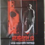
I have always liked the international poster for A New Beginning compared to the US poster and video release cover. I really like this French poster for the movie with the hockey mask immersed in a red light. I also like the blood dripping off of the machete. I kept hoping that Paramount would use [...]

These posters are from the original Italian release of the film. They measure 18 in x 26 in (47cm x68cm), which to me is basically oversized lobby cards. As a stand alone movie, I liked Jason X. It was a lot of fun. Yes, Jason flying in space was a very poor moment in the [...]
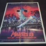
I haven’t seen too many foreign posters out there for Jason Takes Manhattan recently, but I came across this one and there isn’t anything different outside of the different language. However, I love the way “Martes 13″ looks on anything that is Friday the 13th. Also, I like that the subtitle is “Jason Invade Manhattan”.
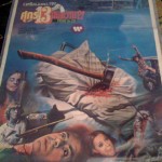
I love the art work involved in this poster. The posters that are released in Thailand can be very beautiful and this poster is no different. The drawings depicting the different scenes of the movie are spectacular and really give this poster a unique and nostalgic look as the one movie that started it all.
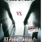
I have been trying to collect as much of these posters as I can find. Below are posters that I have found from different countries around the world. I think they all look pretty good, but the Japanese poster font really stands out. If any of the fans have posters from Freddy vs Jason that [...]
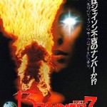
It’s interesting to see the different layouts and type of art used in the interantional posters for the Friday the 13th series. I recently found some of the posters for The New Blood and wanted everyone to check them out. The Japanese poster is awesome! The French and Spanish posters are pretty much the same [...]
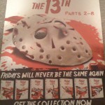
This is a pretty cool poster in that it shows all of the DVD covers together. However, I really am liking the hockey mask laying in the blood in the center of the poster. I hope more of the DVD covers that are released in the series follow this design at some point.
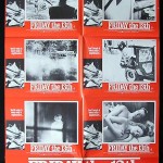
I really love the vintage look of these posters for Friday the 13th (1980). What’s great about the lobby sheet is it can be cut up into lobby cards for display. In fact, a lot of theatres would do so to promote the movie.
I like the the Australian Daybill for the sole reason that is [...]